Five Bad Logos – The Importance of Peer Review in Design
In the world of freelance and startups, young designers might often find themselves working in solitude most of the time. While you may not have a hierarchy to climb or a manager lingering over your shoulder, scrutinizing all of your work, it doesn’t mean you should keep your work from critique.
A lot of times, we become so involved with our project—either too attached or have been working on them too long—to see mistakes. Getting a 2nd, 3rd, and 4th set of eyes to look things over and give an opinion of the work will, in almost every instance, be beneficial.
How about the top 5 logos that could have used a bit more attention in the peanut gallery:
#5: London 2012: Misrepresentation

While skeptics say the logo could be construed as Lisa Simpson having intimate actions, the more overpowering opinion is the logo is representative of an abstract swastika—a symbol certainly unwanted to represent the gathering of the worlds best athletes.
 )
#4: Office of Government Commerce: Subliminal Marketing?
![]()
It might be overlooked by 80% of the population, but once you see it; you’ll never EVER again see it the way it was suppose to be.
#3: MegaFlicks: Typography #FAIL

Make sure your font choices aren’t utterly offensive.
#2: Catholic Church’s Archdiocsean Youth Commission: Situational unawareness
![]()
While the concept might make sense in other circumstances, with the current news surrounding the Catholic Church; the logo went from being acceptable, to instantly inappropriate.
#1: Computer Doctors: Bad Illustration
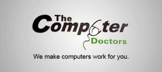
Wow. Just, WOW!
Maybe peer review could have caught these issues before they went public. What an embarrassing piece in your portfolio!