Keeping It Above the Fold

When designing website, content placement can sometimes be tricky. Although most websites are designed in a 1024px width to accommodate most monitor resolution, they can be infinite in length. But remember, you only have a little bit of space to catch the viewers attention and encourage them to continue to navigate the site. So whatever attention grabbing message or content you intend for them to see right away, be sure to keep it above the fold.
The fold is essentially the bottom of your screen. When you navigate a site, all that is visible without scrolling is above the fold, while all unseen information is below the fold. Good websites have enough information, or at least their focal points, in a spot above the fold where visitors don’t need to navigate in order to find what they are looking for right away. Keep things looking clean, to the point, and visible.
But how do you know where the fold will be? Think in resolutions. The standard screen size is compatible to 1024px x 768px. This means everything above 768 pixels is above the fold where people will see it.
Above the Fold
![]()
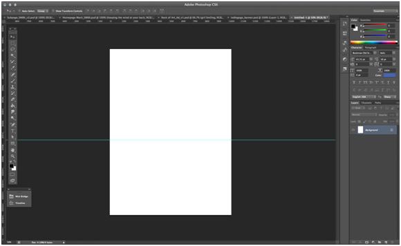
The best way to set up your page correctly is to add grids. In Photoshop, create your template to be 1024×768. Then, align a guide along the bottom of the canvas.
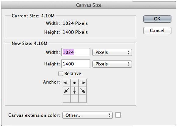
Now when you increase the size of the canvas to accommodate the length of the content, you’ll continuously be aware of what a visitor will be able to see when first visiting the site.

When you extend the canvas, make sure your anchor point is top and center, keeping your guides accurate.

Staying above the fold is most important when designing the landing page, but it’s a great “best practice” to keep in mind when you’re designing across the board. First understand the canvas you’re working on, and go from there.
