Finding the Right Type!
After a week of designing word document templates for the company I work for, I’m finding one of my biggest design dilemmas is pairing the right fonts together. I recently read an article that helped me tremendously when combining typefaces and the rules to use when choosing fonts. Here are some basic rules when combining typefaces:
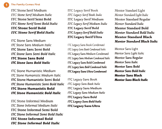
1.The family comes first
Find a typeface that has different weights and proportions within the family. This will provide a range of choices by having several weights that include italic, bold and condensed fonts. This helps when it comes to designing headlines and subheads for paragraph as well as character styles. It should help avoid stylistic conflicts as well.
Here is an example of a typeface called ITC Stone. This is an example of a “super family” because its made up of different subfamilies.
2. Diversity
Having a font with variety is good but having a different type to compliment it is even better. Combining two typefaces will help create a noticeable hierarchy and produce higher levels of visual interest. In the article, “4 Rules for Combining Typefaces,” by Allan Haley he said it perfectly, “The typographic “Golden Rule” for combining fonts from unrelated families is simple: the more dissimilar the type designs, the better the mix.” Start by combining a serif with a sans serif typeface. The goal is to have a nice blend with strong visual contrasts. Here is an example of serif with sans serif typeface combinations.

“But what if I want to use a san serif combo, you ask?” Well, if you want to combine just a sans serif blend it becomes a little more challenging.
The issue here is that the combination of two sans serif typefaces end up looking similar in design—especially to the average reader. Allan said it best in 4 Rules for Combining Typefaces, Strong typographic contrasts typically don’t create problems, but when typefaces from different families that are similar in design are combined, design imbalance is often the result. The casual reader may not even notice that the typefaces are different, but will probably be aware of a subtle, discordant undertones within the design (think navy socks paired with black shoes). So if you must use two sans serif typefaces, remember to use two aesthetically different styles when combining them on one page. But typically, you want to stay away from these similar fonts in a design being they almost never work in harmony.
I hope this helps. If you want to read more rules on Combining Typefaces here is the link to “4 Rules for Combining Typefaces,” by Allan Haley, it’s a great read.