Good Great Best Call to Action Buttons

 One thing we come across a lot is trying to figure out the best call to action buttons on some of the eCommerce websites we work on and even on our own site. As with Google Website Optimizer, we try and convince the client up front that the best thing to do is test. We understand a site may need to have the right branding, but we also try and push our clients to see the bigger picture and test out small changes that can make a big difference. In that vein, we spent the last month drinking our own Kool-Aid and testing out a variety of call to action buttons.
Call to Action Buttons: Results
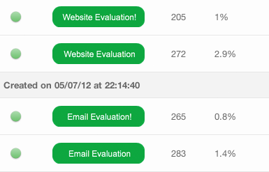
One thing that is surprising is how a small change can have such a large difference in the click through rate. For example, consider the two call to action buttons below.

The difference between the two buttons is simply an exclamation point, but the click through rate on both evaluations on buttons that have no exclamation points is notably higher. Why? Possibly because people think an exclamation point is too pushy or it makes the evaluation seem overly excited. No matter what the reason, we know that adding an exclamation point actually keeps the amount of people clicking through to a minimum.
Another test involves the use of color. What happens if we change the color of the button so it sticks out a bit. We rant the following test changing the call to action button’s color and found that using a warmer color has little effect on the amount of clicks we get so we can keep the branding on the call to action buttons the same.

The idea behind call to action testing is to continually test what makes people click on a button. Once a winner is declared, the winner should become the control in the next experiment and the process should start all over again.
