Dissecting Design: Leveraging Psychology In Web Design
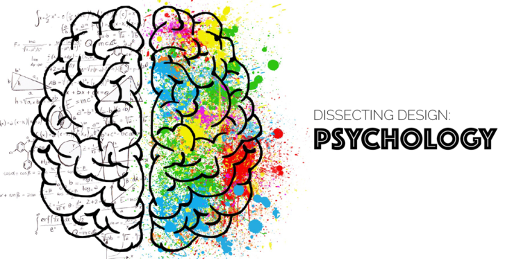
This month, Digital Firefly Marketing is dissecting design. Last week we explored the first component of website design: UI. User Interface is much of the art we think of when approaching web design. But our post included some information on the psychology of design, too. This week we’re diving deeper into how knowledge of human psychology — especially behavior and expectations — can help with conversation and audience growth.
Psychology and Web Design
Understanding how people interact with websites is a big part of the psychological puzzle. Remember, UI should always keep how people expect a site to behave/where to find information in mind. Psychology relative to design is all about actually understanding those customers.
Like with art, you want to get your customer to the goal as quickly as possible. How do you do that?
Your Customers Want a K.I.S.S.
Yup: Keep it simple, sir! As we ingest more and more information throughout our days we want things to be simple. Online information needs to be as efficient as its users. In a world where this information is at our fingertips, if a process is inconvenient or interrupted, a user will simply leave and find the information elsewhere, where the process is clear and easy.Want proof?
![]()
When a site is easy to understand and navigate there is marked, visible improvement in the conversion rate. We can see this looking at The Sims. The popular life simulator game looked at calls to action. After testing six variations, each with a single call to action, they saw marked increase in conversion rate. Each call to action, on its own, increased conversions by more than 40%.
Work Existing Mental Models
Humans interact with the world based on past experience. It’s the traditional example of learning not to touch a hot stove after being burned once. We learn that something glowing red is hot. Because so much of what we do takes place on a computer, users have naturally built mental maps for how to use and navigate websites and social media. And until there are massive shifts in this, it’s better to build off of these mental maps rather than disrupt them.
A great example is one high end company’s shopping cart redesign. TycoonU noticed an 80% drop off from customers who started the checkout process and those who finished by making a purchase.
Upon review, they realized that there checkout page looked more like a Google form or survey, and not like a credible checkout, causing abandoned cart rates to soar. By redesigning the platform to Look and act more similarly to a standard online checkout experience, they saw an increase in conversion of 130%.
Always Weigh Cost Vs. Benefit
Consider this: for a website user, every action come with a price. Time to read, clicks to get to things, providing information on forms. What is it worth to them to stay?
The first thing you need to do is to remind your audience of the perceived value of their action. Next, make sure that what you are giving them is worth what you are asking for in return. You want to distribute your new eBook, but you also want to get an email address. Seems like a fair trade. Filling out a form or survey? You may see many users abandoning the download.
For example, the company Soocial wanted to increase how many people were signing up through a button on their front page. By adding the words “it’s free” next to the button they saw a 28% increase in signups. When you are generous and give people something for nothing (where nothing means no cost, always try to leverage a gain!) they are more likely to click.
Create A Visual Hierarchy
Thinking back to last week, always consider the interface design. Users are more likely to do what you want them to (click, enter, swipe, purchase) if you make it clear and easy. One of the easiest ways to simplify the process is to strategically lay out the design.
There are three tricks to this:
Bigger & Bolder: Big, bold elements are noticed first. If you want your users to read: make your headings big. If you want them to click, use a different color so they don’t miss what you’re directing them toward.
You Gotta Recognize: Don’t go too far outside of the box when trying to get users to do familiar things. If you want them to click, use a button . Users are more likely to interact with something when they already know what it is, how they are to use it, and can predict the outcome.
Don’t Stray: Decrease the distance between the user’s cursor is sitting and the action. The best place to place the button is at the end of the explanation of what you’re offering. This makes it a simple continuation from reading to doing.
The Vineyard, a high end hotel in London, saw a 32% increase in reservations when it moved its text stating “make a reservation” at the bottom of the page to a red button at the top. What simple fixes can you make to make it easier for people to click?
Always remember that users are finicky and just like slow loads will make them leave, so will having to spend a lot of time getting to your target.
Get Personal
We are a social animal and we trust others. One way this shows up in digital marketing is the use of human faces. Including faces on your site helps in two ways. First, your audience is attracted to faces. They will automatically look to it for clues. Second, because we are used to looking to faces for clues you can express a great deal. Happy people using your product or working with one of your staff members is likely to increase conversations.
Often times as web designers, we forget that there is a living, breathing user on the other side, not just Google Spiders. So relate to them. Demonstrate your human side!
One way to relate to your user is the use of human faces. Including faces on your site helps in two ways. First, because we’re naturally social animals, your audience is attracted to faces. Second, they will automatically look to it for context clues. We are used to looking to faces for clues you can express a great deal. Happy people using your product or working with one of your staff members is likely to increase conversations.
Medalia, an online art retailer, switched from thumbnails of artwork to pictures of the actual artists and saw an increase in conversations of nearly 96%. The simple act of using human interaction, even with a photograph, is a way to take advantage of human psychology.
Your Future Web Designs
When designing or redesigning your site in the future, be sure to keep psychology and art in mind. Knowing how people use the internet, and how they interact with a page will greatly improve your ability to design a site that meets expectations and provides ease of use. Or … get in touch with us and see how your site stands up to our design audit. And be sure to come back next year as we continue dissecting design and also continue the conversation on social media with #DissectingDesign