Adwords Quality Score: A Foolproof Way To Improve Landing Page Experience

This week we’re continuing our look at Adwords quality score. You can review what it is and familiarize yourself with ad relevance if you’re new to this topic. Last week we looked at eCTR (expected click through rate). The final part of quality score is landing page experience.
What Is Landing Page Experience?
Google considers the landing page the place people arrive when clicking on one of your ads. The landing page experience (LPE) is their reaction to that page. It’s essentially all about whether or not the landing page fulfils the intent of the user.
Google is successful because people are satisfied with the results it provides. It does this by always considering intent in its algorithm. Google applies this principle to Adwords, too. When you create an ad and attach a landing page Google scans that page to determine whether or not the ad and the landing page match. When using Adwords, always make the landing page relate closely to the content you discuss in your ad.
What Does Google Consider When Rating LPE?
There are many factors that affect LPE. This post looks at three that are vital to your score: landing page relevance, ease of navigation and page load time. There’s a lot more to this, so be sure to sign up for our emails to get weekly updates to deepen your knowledge.
Landing Page Relevance
Remember “load to goal”? That principle is important when crafting ads, too. You want to help users get to exactly what they’re looking for every time they click on an ad.
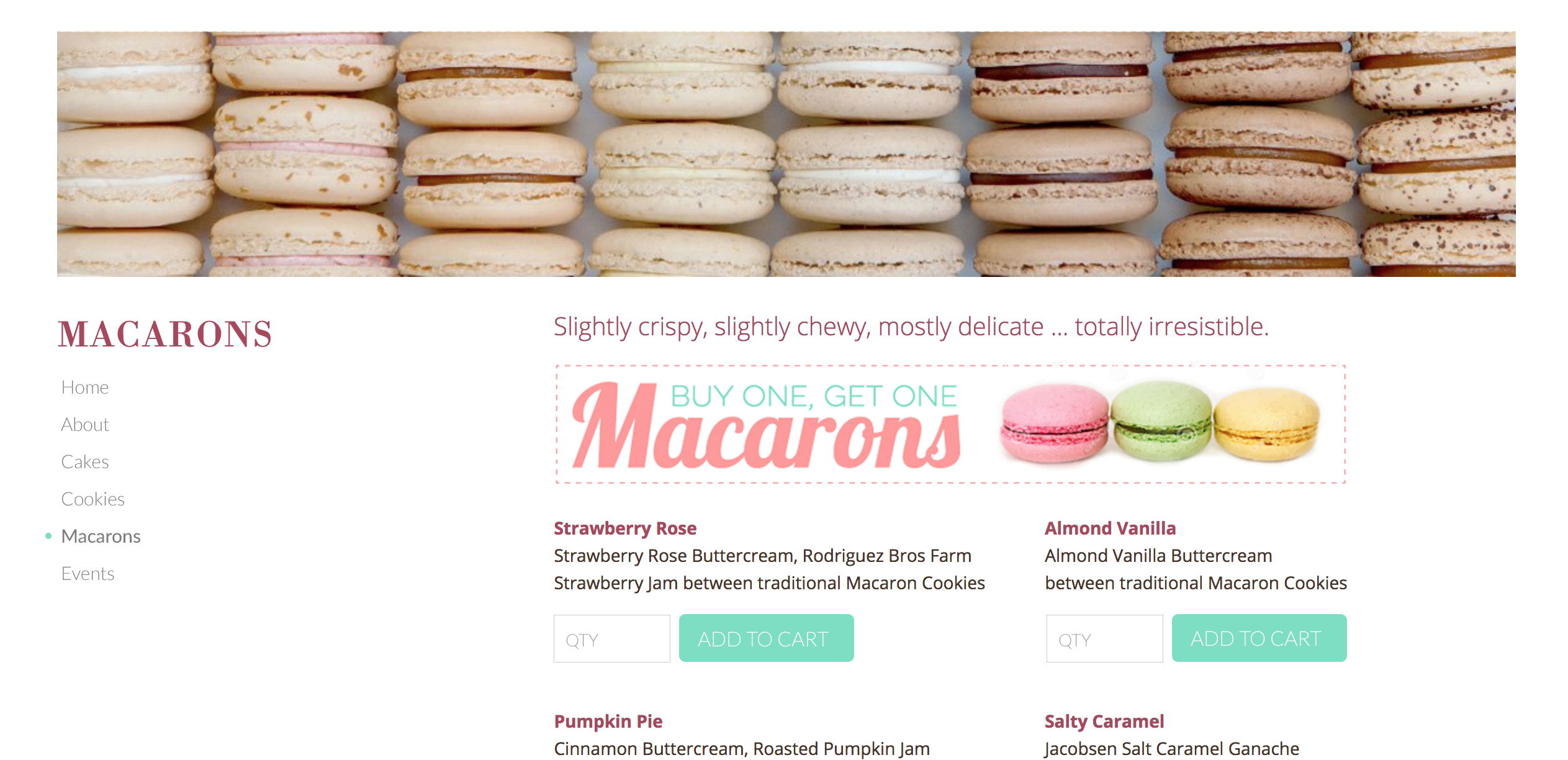
Let’s pretend you own a bakery and have decided to start an ad campaign. The first thing to remember is that people are likely searching for two different things. First, there are specific searches. People, for example, want macarons — the delightful, complex French confection. Then there are general searches, people aren’t sure what type of desserts to offer at events. 
In the case of people looking for macarons, get as specific as possible. One of your ads might be for a BOGO deal on macarons. After crafting your ad text you will add a landing page. Your instinct might be to simply link to www.mybakery.com, your homepage. This makes sense, you want to get people to your site. But is this the best experience you can give your user? What do they have to do once they get there? 
One option is to have a banner on your homepage that matches your ad boasting your BOGO macaron deal. But that requires a second click.
You want to get them from load to goal, so the best option is to build a landing page specific to your deal. From the ad take users directly to your current selection of macarons. Include the ability to add these delectably addictive cookies to their cart and bam! You’ve created a relevant landing page specific to their search. People search for macarons, your ad shows up, they click and can immediately shop.
But what about people who are looking for desserts but don’t necessarily want macarons? Creating a more general ad for your bakery and how you provide the perfect dessert spreads for parties and events hooks people planning events. A landing page that includes a gallery of your items and spreads you’ve set up (or that your loyal customers have made and put on Instagram) is the perfect landing page.
In both cases, Google scans the ad and follows the link. When you talk about BOGO macarons and they go to a landing page optimized for the same, Google rates your landing page experience higher. When you’re using more general terms like “event dessert bar” and have a landing page that matches this, you’ve done it again.
You should always create ads that are specific and ads that are general to leverage your exposure.
Ease of Navigation
In addition to making the landing page for each ad exactly what your users want, be sure that once they get there it’s easy to get from load to goal. Make forms simple to complete, use buttons that make sense and always put the most important information above the fold.
Page Load Time
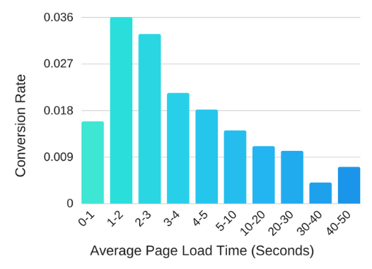
Believe it or not, one of the things that can completely turn people off to your site is load time. Your page must be optimized to load quickly across all platforms, including images and videos. A fast site is good for UX and a good user experience leads to higher conversions (Hobo).
(Forbes)
The Telegraph, a UK newspaper, saw pageviews drop 11% for a 4 second delay. When the delay was 20 seconds page views dropped an additional 44% (Optimizely). Conversely The Trainline, a UK-based train travel site reduced latency by .3 seconds and their revenue increased by 10.6 million USD (New Relic).
Does speed really matter? Google tested on themselves to answer this question and the answer is a resounding yes (Kissmetrics). Google A/B tested changing their search results page from 10 results to 30. The addition of 20 results increased load time by half a second. Traffic dropped by 20% as a result. That means people stopped searching with Google, king of the internet, for half of a mississippi. Chances are your site is not quite as popular as Google. The search engine has loyal backers. If a half a second influences Google’s traffic, what’s it doing to yours?
Next week we’ll tie quality score to SEO complete with tips to make sure you’re paying attention to both when building ad campaigns.
