Dissecting Design: The Art of Website Design
This month we’re looking at design. Design is an aspect of digital marketing that entails a lot more than what we initially think of. It’s not just about making something pretty. Design includes understanding consumer behavior and creating a positive user experience. Why? Because your goal, always, is to get visitors to do something. It could be subscribe, swipe, click, share or make a purchase. We call that going from load (landing on the page) to goal (the action you desire). Then it goes far deeper into the bones of a website. Get ready to deepen your understanding of design this July starting with understanding User Interface.
Four Facets of Design
If design isn’t just making pretty logos and determining which font to use, what is it? It’s a complex, living organism that must be monitored and changed. Let’s look at the four components of design, what they mean, and how they work with each other. This week? The part we all think of: User Interface or UI Design.
User Interface Design
Commonly referred to as “user interface” or UI, this aspect of design involves how a site and user interact. It’s the “art” part of design. Do things that look like buttons act as such? Is the setup of the website one that is easily digestible? Do things that look like they swipe, swipe? In short, is the site presented in a way that makes it easy for the user to get from load to goal? If you want someone to buy something from your site do you have clear menus and ways to view products? Does your “add to cart” option make sense? Is the important information above the fold? While art can take some risks and it’s okay to do things differently, be sure that your site is easy to navigate and laid out in an understandable fashion or else you might find your bounce rate increase.
How do you know if your User Interface is good and the art part of your design works? Like with good writing, you want to eliminate any clutter. Backgrounds that are a solid color are far easier on the eye and less distracting. Information that can be understood visually is far better than lots of text on a design element.
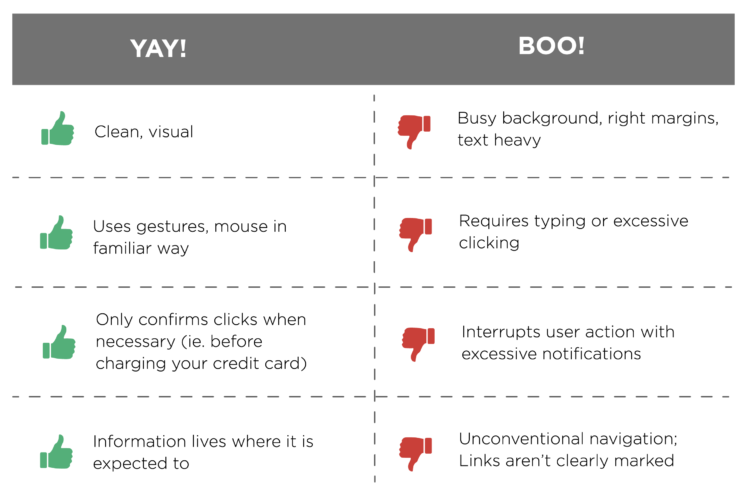
Good UI vs. Bad UI
Here are some examples of good vs. bad user interface.
 Our favorite example of a good user interface? The Los Angeles parking sign redesign. No one walks in LA, which is part of the reason their street signs look like this:
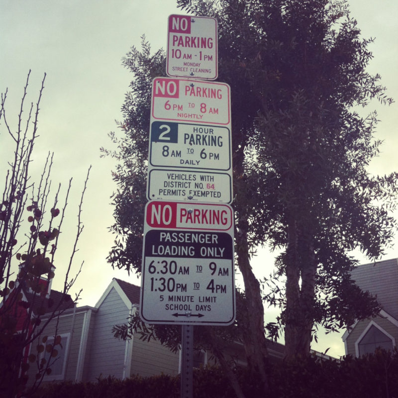
A designer from Brooklyn, Nikki Sylianteng got several tickets in a short window of time while staying in LA. As a designer she started to think about how the design of the signs could be improved.
Sylianteng realized that drivers only care about two things: whether or not they can park somewhere and, if they can, for how long. She created a prototype and tried it in her Brooklyn neighborhood where it was quickly embraced. Her idea is now spreading around the world with new signs in places like Brisbane and New Haven. Talk about a great use of User Interface!
How the LA Parking Sign Redesign is Good UI
Looking at the new sign, which replaces a slew of signs and condenses them into one, easy to read display, we see a few examples of excellent UI. How do we know? Look at the ways Sylianteng easily communicates to drivers whether or not they can park and for how long. 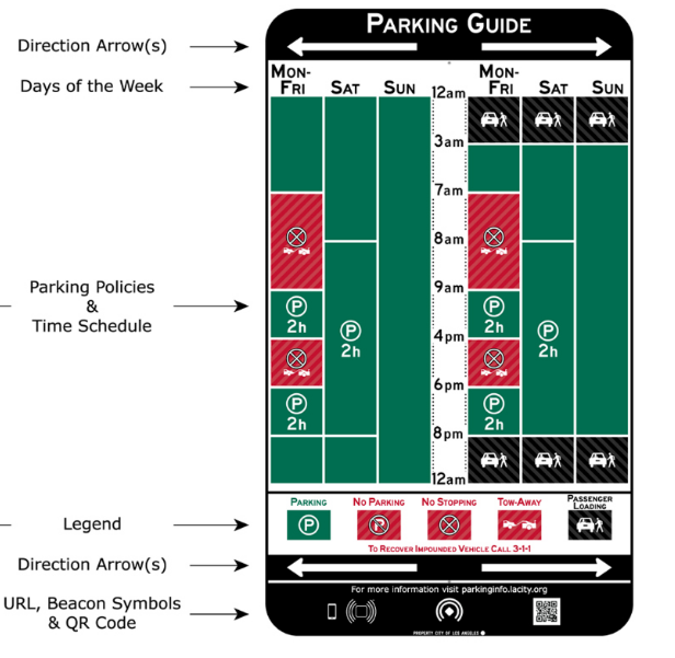
- Known colors. It’s universal! Green means go and red means stop. Green means okay and red means you might want to rethink that. The design clearly communicates when you’re good to go (Sunday!), when you’ve got to set an alarm because you can only stay for 2 hours) and when you’d better move along so as to avoid a ticket or worse, a tow.
- A clear font. The use of a simple, all caps, sans serif font makes it very simple to read these signs without squinting or confusing terms. Especially for non-native speakers of English clear writing makes things quick and easy.
- A simple legend. While most people know that a P in a circle means “parking” the legend is helpful for new drivers and also makes it easy to see when even stopping is prohibited.
Good UI requires simplifying visuals and processes down to its core purpose. Then making sure that every design element reflects that purpose.
If you like Sylianteng’s style as much as we do, be sure to sign up for her newsletter to follow her adventures in parking signs and other projects. We reached out to ask her what is coming down the pike and she clued us in on three projects in the works:
City Objects
This is a UI pattern library for the physical world. Sylianteng said, “We have them for websites, why shouldn’t we have them for physical things which is the UI for our cities?”
Crossing The Aisle: A Reading List
Sylianteng is compiling “a reading list for getting out of your echo chamber. Why is there no place online dedicated to stories of people coming together despite their differences?”
Healthcare
“I put the Senate Healthcare Bill on Medium,” Sylianteng stated, “so we can annotate and discuss implications of the bill in context. We have very sophisticated online tools to discuss articles such as future autonomous vehicles, virtual reality and others. But something as urgent as this healthcare bill is locked in a flat PDF? Why?”
Visual Best Practices
Here are some tips using design theory to ensure good choices when designing.
Typography
Best Practice: Use no more than two different fonts across your site.
Why: This creates visual simplicity. Remember that BIGGER, BOLDER words carry visual weight so you can direct your audience to specific places on your site by making headings and callouts bold. The use of two fonts becomes part of your brain identity — when people see them they immediately think of your products. We’ll get into this a little more next week.
Color
Best Practice:Use no more than 5 colors across your site.
Why: Complicated color schemes confuse your audience, taking away their ability to quickly decide where they should go first. A minimal color scheme (3 is best) allows users to remain focused, for less distraction, and creates a visual hierarchy connected to those colors.
Depth of Field
Best Practice: Design elements so that they feel and act as if they were a tangible object.
Why: When you bring the depth of field toward the user, you’re showing them that this element is more important than other content and elements around it. Google calls this “Material Design”. The best example is buttons that look like they could be pushed. Shadows also help create depth of field.
Three Click Max
Best Practice: Don’t make any necessary action take more than three clicks.
Why: You want to users to do something, so help them get from load to goal quickly and easily. The more actions you make a user take, the more chances there are to lose their attention.
Continuous Click Through
Best Practice: Create plenty of options to allow users to click through your site.
Why: Even if the goal is fewer than three clicks away, you want to keep users clicking around your site. Link to blogs with more information, case studies reflecting content on a landing page, your 3-day sale. Basically: give them opportunities to stay on your site. The longer they stay, the more likely they are to take action.
Have examples of good or bad user interface? What about questions? Let’s continue the conversation on Social — just tag us and use #DissectingDesign. Join us next week when we look at the next facet of design: psychology. We’ll look at how human behavior can affect conversions and bounce rates as well as provide some excellent examples of using psychology to improve your stats.