Dissecting Design: User Experience

What’s the joke? If you ask 3 lawyers the same question you’ll get 5 answers? It’s a similar story with UX or User Experience. There are many definitions. At Digital Firefly Marketing we think of it as the experience a user has on website. In simple terms: user experience or UX is the functional part of web design. What defines a user’s experience? Is it fast? Responsive? Does it make sense? When designing a site and thinking about its functionality, the goal must be to improve customer satisfaction and loyalty by providing an environment that is useful, simple and memorable. Let’s look at some ways to do that.
Why Functionality and UX Design Matter
Why is it that some websites, when there are countless, get such high traffic? We search almost exclusively through Google, shop with Amazon and find out where to eat using Yelp. Simply put, it’s because they provide a seamless experience: type what you want, click, get the results. These sites add little perks, like alerting you to products you might like based on your purchase history or alerting you that you keep walking past a brand new restaurant you’re likely to enjoy. In other words, they provide an experience that is useful, simple and memorable.
Successful sites are designed with these three things in mind. But it’s rare we directly think about the functionality of a website, unless we stumble across one that is absolutely terrible. Then we notice it. And we avoid it in the future. In fact, our Director of Design, Marissa Treece, is often heard saying that she loves to peruse websites to figure out exactly what she never wants to happen on ours. That sort of backwards planning will improve your functionality greatly. Here are four ways you can incorporate an awareness of functionality throughout your design process to keep your site useful, easy, and memorable in a good way.
Site Architecture: You Have To Look At The Bones
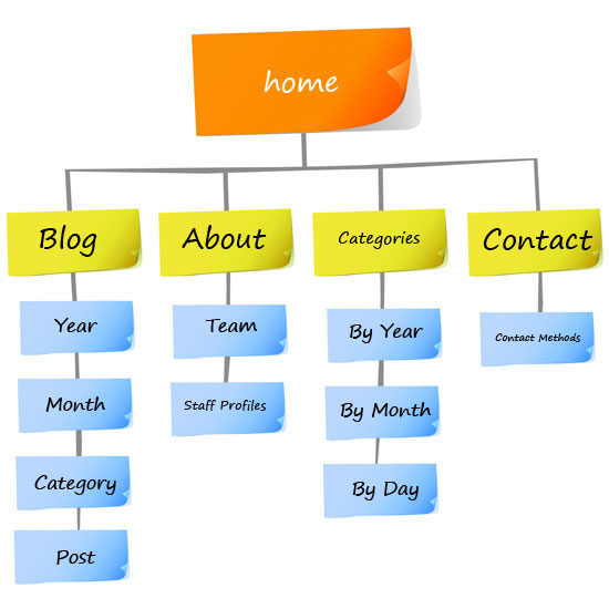
Site architecture is the blueprint of your website. How do your pages link to each other? What’s your hierarchy? Does it make sense? Can users get quickly from where they land to where they want to be?
Creating a site map ahead of time is a great way to organize your site and to make sure that it’s crawlable, both by search engines and your users. When your site is indexed by search engines, this organization pays off. Every site on the internet is indexed to figure out how to show search engine results. Sites that are crawled quickly thanks to a good site map tend to rank higher on Google. Make sure that your pages link in a sensible way. Every time you add a page, think about navigation. What is the most sensible way to set up your site so that your audience can navigate to what they are looking for intuitively?
Along with making things easier for your user, search engines are able to more easily crawl sites with a site architecture that is complete, contains internal links, and has a sensible flow. The spiders can easy start at the main page and branch out to quickly find and index all of your content. A home page with random links off of it often leads to dead ends or facilitates orphan pages. The spiders hate dead ends and orphan pages.
When designing a site map make sure that your URLs are descriptive and organized. This helps you on two fronts. First, a user can easily intuit the page they might want to get to but can’t find and simply type it in. Second, this is great for SEO. Content keywords can easily be reflected in the URL. Consider using a standard format to keep your URLs descriptive and search engines happy:
www.home.com/subpage/tertiary-page/keyword-rich-slug
Functionality: Your Site is Beautiful, but Does it Work?
The Internet is vast with lots of competition. For that reason, your site must be accessible and intuitive. When working on the design of your site, it’s vital to keep a few things in mind.
What’s the goal? Your site may offer lots of things: information, entertainment, resources, a way to contact you. But at the end of the day, your site only has one goal. Whatever that goal is, everything on your site must direct visitors toward it.
Consider your user’s past experience. Unless you are targeting a very specific niche, remember that the audience visiting your site comes with a set of experiences and skills. Make sure that your site makes it easy to direct them to your goal. Your site should be accessible to anyone who visits.
Is it more than just pretty? Sometimes sites have a visual element that makes perfect sense to the people designing the site but zero sense to a user. While a beautiful design is appealing for a few seconds, users quickly get frustrated when they cannot figure out what to do. Make sure you let outsiders critique your design and listen to their feedback, especially the aspects of your site that slow them down or confuse them. If you’re getting a lot of feedback like, “I thought this would do x but it did y,” listen and change the element to match their assumptions.
Your site should communicate and engage. Your website doesn’t need to have an AI widget that converses with users, but it should be communicative. Here’s how.
First, it should let users know they are on the right path by acknowledging actions. If a button is clicked and something is loading, there should be feedback that shows this. If a user wanders off the path or enters something incorrectly into a form they should receive feedback that helps them do the right thing.
Put The Pedal To The Metal
Site speed is imperative. Too often in a quest to have a beautiful design developers and designers forget that some of the big bells and whistles slow a site down. Users want what they want and they want it now, so don’t risk them going to one of the million other sites that has what they need just for a great sound or video clip.
Minify CSS, JavaScript and HTML
When coding a site, it’s important to keep the code to a minimum. Every extraneous piece of code only does one thing: slows down your site. Check CSS, JavaScript and HTML to make sure you are using the least amount possible to get your site to do what you want it to. (HINT: be diligent about vetting your themes! They come with a lot of extra garbage.) This will help with your overall speed because less code takes less time to read and translate.
Optimize images
Large images can slow down a website pretty quickly, so be sure to follow these time-saving techniques.
Use the right file type. Use JPG or PNG files for your website images. We recommend PNG because they allow you to save your image with a transparent background. This means seamless placement on your site.
Make your image web friendly. Images can run into issues in two ways. First, make sure you save your image at the correct dimensions. Be sure when you are creating and viewing you do so at 100%. Saving it at incorrect dimensions can lead to a blurred image when it gets onto your site.
Compressing an image for web use also makes a significant difference. Compression removes extra data that isn’t needed for a photo to appear on the web, reducing the amount of time for loading.
Responsive Design
Think about how often you access the internet from your phone these days. Chances are it’s more than your desktop computer. Mobile digital media time is significantly higher at 51% compared to desktop, which clocks in at 42%. That’s where responsive design comes in.
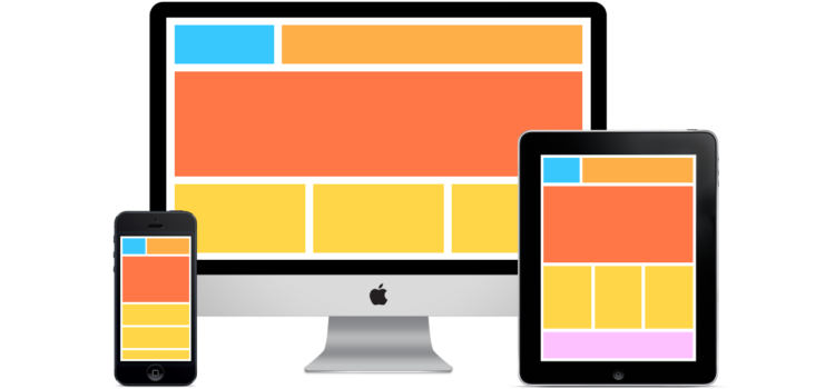
In short, a responsive site will automatically adjust the design to properly display on any size screen. That means no more pinching the screen to read. You create one site that gives users what they need no matter when or where they open it. Not only is a mobile website good for your user’s experience, but Google now penalizes site that are not built to be responsive.
Moving Forward
As you think about your existing site or plan to create one, make sure you keep the goal of your site in mind during every step of your planning. Providing a good user experience, one that is simple, useful and memorable will pay off as your users are led to what you want them to do from the moment they land on your site.
