How to Use Facebook Insights
 Facebook has been on a tear and earlier this week they made a major upgrade to Facebook insights. With such a major upgrade, we felt there were probably a lot of questions on how to use Facebook insights and decided to put together a sort of unofficial guide for the rest of us along with some interpretation of reading each graph. The official Facebook guide to the new version of insights is available from Facebook.
The first step in understanding how to use Facebook insights starts with the main insights page. The main insights page now looks like this:
This is your home base and give you a snapshot of how your Facebook page has been performing. It’s main goal are to show you how big your audience is, and how viral your content has become in the Facebook world. Let’s look at each metric individually to see what they do.
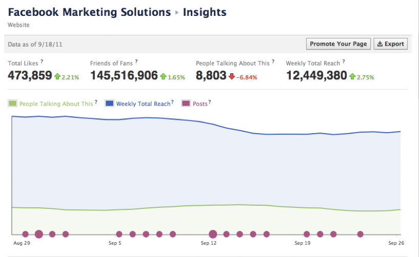
The first report measures your audience and it appears at the top of the page and looks like this:
![]()
It consists for four metrics; three of which are brand new and require some explaining so you can understand how to use Facebook insights more effectively.
- Total Likes – This is a measure of the total number of people who have liked your page i. e. it is your fan base and should be considered your audience.
- Friends of Fans – This measures how many people are currently connected to people who are already your fans. It’s a good representation of the total possible audience for a piece of content going viral.
- People Talking About This – This metric made a debut last week. It measures the amount of Facebook engagement your page has had in the last 7 days and is a good representation of fans that are advocating your brand and only falls short in lumping fans all together rather than segmenting them into passive fans and super fans.
- The weekly total reach are the number of people who have seen your posts.
Each metric covers the last 7 days and is rolling so each day gets a little bit worse or better. The percentages relate to how you are faring v. the previous 7 days. Obviously green is good and red is bad.
While the weekly averages are good, they don’t tell the whole story. The second graph is the amount of fan engagement over the last 28 days. Once again, this graph is rolling so every day will move the gprah one day forward. The 28 day insight graph looks like this:
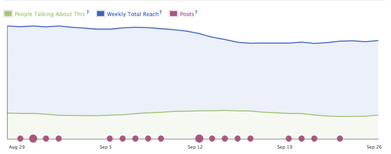
The line graph represents three metrics from above doing away with the total likes metric in the old Insights. The blue line shows the running 7 day weekly total of people who have seen your post and the green line is running 7 day total of the people who have talked about your page (likes, comments, tagging, etc.) The violet circles are the number of posts that were generated by you and other Facebook users posting to your wall on that particular day. So this metric is not rolling.
It’s important to note here that each dot on the line is a corresponding date. On that date is plotted the 7 day weekly total (weekly reach) and the 7 day weekly total of People Talking. It’s not the amount of people you reached on that day or engaged with your posts. This graph is meant to show that your content and page have a certain amount of time that a post can live and will begin to reach more people and engage with more people over that time.
Interpreting this graph is relatively straight forward. It’s main thrust is having you understand if the content you have been creating over the last few days is being engaged. Let’s say that over a 7 day stretch you post two blogs a day and the blue line stays relatively flat but the green line diverges away, well that means your content while high in quanity is not to your user’s tastes. However, let’s say you only post once a week, but over the week the green line converges towards the blue line. This means your content is of a high quality. The blue line can also be trending up due to a Facebook ads along with sharing so it’s important in how to use Facebook insights to not only look at the whole effect of all your content being posted but also how each individual post does.
The last graph on the main page is the posts report. This shows you the individual stats for each post so you can see which post had the most engagement from the Facebook community. The graph looks like this:
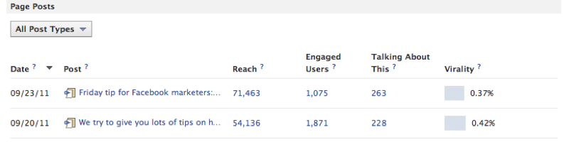
The first two metrics are relatively straight forward. The Date is the date the post appeared. The post is the title of the post, status update, photo album etc. The four other metrics require a bit of explanation but this particular one is cool because each number is interactive.
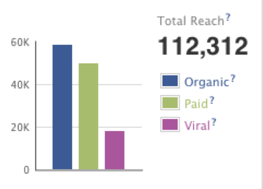 Reach
Reach
This is how many people saw your post. When you click on the reach number you get breakdown of organic, paid and viral.
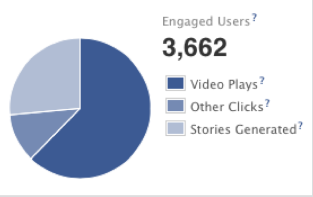 Engaged Users
Anyone who clicks on your link, watches a video or looks through your photos is considered an engaged user. It simply means that at some point they have clicked on your pages. This number includes the people are talking about this metric so anyone who likes your post is also considered an engaged user. When you click on the number you get a graph that breaks down their actions:
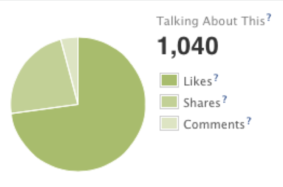 People talking about this
This is the same metric as above, which measures how many people liked, commented and posted on your page. Meaning they are no longer anonymous but have advocated the page to their friends. The numbers break down into exactly what action they took on your page. Then, you can see how people are interacting with your posts.
The above should give you a fairly good overview of the main page. There are three other sub pages that will also increase your knowledge of your reach, fans and what people are talking about. Once you understand the main page, the sub pages are actually quite easy to understand.
Overall, the Facebook Insights is a much needed change from the old analytics. This gives brand managers some really good clarity on their content and what tactics are working and what are not. The biggest takeaway you can get from these stats is to provide your fans with good content. Then, they will be more likely to share it and increase your chances of going viral.