The Web Design Trends Taking Over 2018

A few weeks ago we looked at font trends for 2018 and noticed a pattern: rule breaking abounds this year. Whether it’s color fonts or serifs, chances are if you’re worried about doing it, it’s the right thing. This rogue approach doesn’t just apply to fonts, though. Check out 2018’s web design trends.
2018: The Year Web Design Trends Broke Every Rule
There’s so much incredible stuff coming at us on the design front it’s hard to keep track. We’ve compiled our favorites with examples, tips and expert insight. What’s your favorite?
Rethink 90°Angles
Clean lines give designs a beautiful aesthetic but they’re a bit passé. Designers are changing things up in two ways. First, rather than separating items into rectangles they are keeping the perfection of the shape with one modification: the uniformly rounded corner. 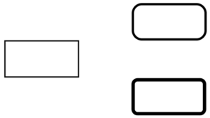
Second, when straight lines are preferred, designers are twisting them a few degrees to freshen up the old take on clean lines. A great example of this is the Stripe homepage. (Webflow Blog)
<Video>
We know that video is huge but we also know it can be cumbersome. From poorly embedded videos to those that slow everything down, when video is off it throws off a whole page. Using the <video> element allows for seamless integration of your own movies, not those pulled from YouTube that can render poorly or include ads. Syncing video with content provides an even richer experience and has been one of the most popular web design trends this year.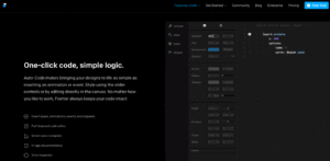
Turn The Page
Parallax, infinite scroll and in-page navigation have spiced up how we navigate through the pages of a site for a few years now. What hasn’t changed is how we get from page to page within a site. Page transitions are appearing on more and more sites, allowing a seamless website experience without the boring blank page reload we’re used to. Check out these samples from Codrops.
Go Big Or Go Home
Bigger is better if we’re to believe the trends in website design we’re seeing so far this year. Big, bold typography. Big colors. Huge images. Design is a way to communicate your big ideas and in 2018 people are doing that on a big scale.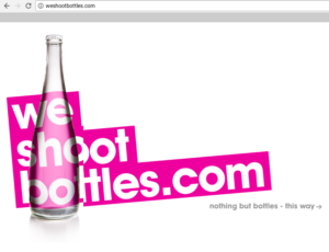
Also going big? Process and intricacy. We’re seeing more and more hand drawn, digitized drawings featured on websites instead of photography and video. This splash of analog in our digital universe is refreshing.
The Rules (of physics) Don’t Apply
Parallax scrolling is on a downward trend but those who love the aesthetic are finding ways to get it to work with 2018 trends: unexpected scrolling rates. Whether it’s an advancement in technology or an answer to decreasing attention spans, these unique scrolls add fun and flavor to any aesthetic.
This example is a bit cluttered but look at all the different ways they’ve coded the site, which serves as a living portfolio to design work.
Go Off The Grid
One of our favorite 2018 web design trends is the broken grid layout. Rather than opting for the perfectly portioned boxes of content, typography, images and accents, savvy designers are breaking out of the box. The result? Sites that come across like an artist’s wall or page from a planner. Marché Notre-Dame has a page reminiscent of handmade invitations that use stamps and layers of vellum. The effect is gorgeous.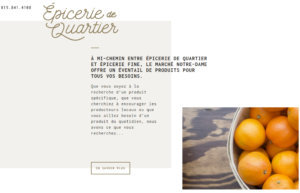
Particle Man, Particle Man, Doin’ The Things A Particle Can
Remember those video backgrounds that were everywhere in 2016? They’ve lost favor with designers who want content and design to work hand in hand. Instead, many are opting for gorgeous particle backgrounds. These collections of moving pixels liven up a static page but avoid rendering problems and don’t detract from content or overwhelm visitors.
Which Hot Design Trend Do You Want To Try?
Time for a new look? Get in touch today and we’ll provide you with a free design audit showing you how we can update your site to make sure it is in line with what users expect.
